I’m a sucker for a pretty video game HUD. The heads-up display is there to present information to the player, but it’s really easy for it to get cluttered. Some games (notably Dishonored, which I’m replaying right now) give you the option to turn off the HUD altogether, which is pretty cool if you want total immersion in the in-game world — no gamey distractions.
However, I prefer a simple HUD with just enough information to get by. It should fit with the game that I’m playing — maybe seamlessly blending into the surroundings, or being stylized so it looks like part of the world.
There are a lot of eye-catching displays out there, as well as some truly innovative ones. (I love Metroid Prime‘s!) Here are three of my personal favorites from games I’ve played.
Halo 5
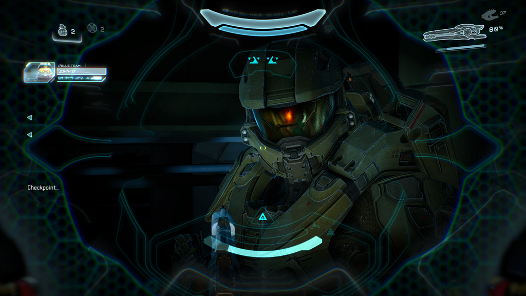
 I’m a fan of the Halo games’ HUDs in general. They make you feel like a soldier, as the display is what’s inside your helmet. They don’t crowd too much information in there. However, Halo 5‘s stands out to me for its new, colorful design. It’s the knockout of the bunch, taking the simplicity of the previous games’ interfaces and making a curvy HUD that’s super sci-fi pretty.
Dead Space
 Dead Space lacks a traditional HUD, which is exactly why it’s so cool. It’s actually a holographic display integrated into the main character’s spacesuit. You can pull up detailed information when you need it, but it’s gone the rest of the time. This is so innovative for making you feel like you are the character, using the suit’s interface in a realistic way. It’s also extremely well-designed — just look at those lights on the back of his suit, which turn red as his health depletes!
Destiny
 I got obsessed with Destiny early this year, and one of the things that stood out to me about the game is how gorgeous its interface is. (This includes the menus, but I could write a whole other post about that!) The HUD isn’t ingenious in any way — it does the typical HUD thing, showing your special skills’ cooldowns, how much ammo you have, etc. But to me, it’s similar to Halo 5 in being a gorgeous, colorful way of displaying needed information in a style that suits the game’s overall atmosphere. Just seeing that SUPER CHARGED temporarily appear onscreen when my super is ready to deploy looks (and feels) amazing!
I also like the use of Ghost, which you open with a button to show you mission information. That way, it doesn’t clutter up the screen the rest of the time.
I’m sure I’m missing some awesome HUDs. There are others I like, but these are the knockouts to me! What are your favorite HUDs? Do you like them, or do you prefer to turn them off when given the option?
— Ashley
Leave a Reply to wolfyseyesCancel reply